For US CMA candidates, using data visualization simply means presenting financial information in a clear and structured way so people can understand it quickly and make better decisions. It starts with spotting a finance problem, choosing the right data, and presenting it visually so trends, gaps, and risks are easy to see.
Today, data visualization is no longer a fancy extra skill in finance. It is a core part of how CMAs work with cost management, performance management, and strategy.
This article breaks down how tools like financial dashboards, reporting analytics, and Excel charts help CMA candidates explain numbers clearly in exams and real finance roles.
What Data Viz CMA Means in Finance Reporting?
Let us simplify this again.
Data viz CMA means using visuals to improve finance reporting and decision-making. It is not about fancy designs.
Good visuals help answer:
- What is happening?
- Why is it happening?
- What action is needed?
Finance reports are read by many non-finance teams. Visuals help bridge the understanding gap.
This is why financial dashboards, structured reporting analytics and simple Excel charts are now standard in finance reporting.
Why Data Visualization Matters for US CMA Candidates?
US CMA candidates deal with complex financial data daily. Budgets, forecasts, KPIs, cost structures. But management expects clear answers, not complex spreadsheets.
This is where data viz CMA becomes powerful.
Data visualization helps convert raw financial data into actionable insights. Trends become visible. Problems become easier to spot. Decisions become faster.
This aligns directly with CMA Part 1 areas like financial reporting, planning, performance management, and data analytics.
If you want to see how performance management and data analytics are actually taught in a CMA-style classroom, this short session explains the thinking clearly.
Data Visualization Techniques Used in CMA Style Reporting
US CMA candidates do not need every visualization under the sun. They need visuals that support finance reporting and decision-making.
Here are the most common techniques used in data viz CMA applications.
- Line Charts
Line charts are used to track trends over time. Revenue growth, expense movement and margin changes. These visuals help explain patterns clearly and support forecasting discussions in finance reporting.
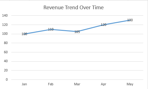
Figure 1: Line chart showing a monthly revenue trend using dummy financial data created for illustration only.
- Bar and Column Charts
These are widely used in Excel charts to compare categories. Budget vs actuals, department-wise costs and regional performance. They make comparisons quick and obvious.
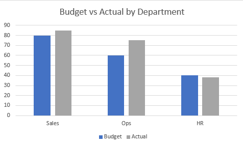
Figure 2: Bar chart comparing budgeted and actual values across departments using dummy, non-real financial data.
- Scatter Plots
Scatter plots help identify relationships, such as risk versus return or cost versus output. In reporting analytics, they support analytical thinking rather than simple reporting.
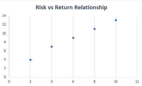
Figure 3: Scatter plot illustrating a risk and return relationship using dummy data for finance reporting explanation.
- Pie or Donut Charts
These are used to show composition, like expense or revenue breakdowns. They work best when categories are limited. In data viz CMA, clarity always comes before decoration.
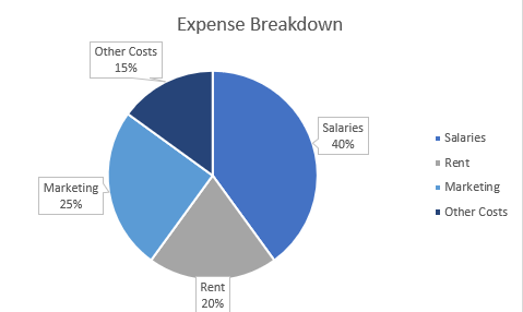
Figure 4: Donut chart showing an expense breakdown using dummy financial values for demonstration purposes only.
- Bullet or Gauge Charts
These visuals measure performance against targets. They are commonly used in financial dashboards for KPI tracking and management reviews.
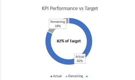
Figure 5: Donut-style KPI chart comparing actual and target values using dummy financial numbers.
All these techniques align with the CMA syllabus areas that involve data presentation and interpretation.
Tools CMA Candidates Use to Apply Data Viz CMA
One important thing to understand is this. CMA candidates are not expected to become data experts. They are expected to use tools to support finance reporting. That is why data viz CMA stays practical.
- Power BI
Power BI is one of the most widely used tools for building financial dashboards. It allows finance teams to track KPIs, create real-time views, and support monthly reporting.
It is commonly used for cash flow visuals, receivables aging, and performance summaries.
- Tableau
Tableau is known for interactive visuals and strong charting capabilities. It is useful for trend analysis and performance reporting using financial datasets.
Many CMA candidates use Tableau to practice applying reporting analytics concepts to real scenarios.
- Other Reporting Tools
Tools like Qlik Sense or Zoho Analytics are also used in some organizations. They support collaboration and AI-driven insights.
The tool itself is secondary. The ability to explain numbers clearly is what defines data viz CMA.
How CMA Candidates Can Use Data Visualization?
Now, let us talk about real usage. In finance roles, data viz CMA shows up in everyday reporting.
Below is a simple step-by-step way for US CMA candidates to apply data visualization in exams and real finance roles.
Step 1: Identify the Finance Question First
Before touching any tool, be clear about the question.
Examples:
- Why are costs increasing?
- Which department is overspending?
- Is cash flow improving or worsening?
In data viz CMA, visuals are created to answer a finance question, not to decorate reports.
Step 2: Select the Right Financial Data
Pull only the data that supports the question.
For example:
- Budget vs actual data for cost control
- Accounts receivable aging for cash flow analysis
- Monthly revenue and expenses for trend analysis
This step is critical for clean reporting analytics and avoids information overload.
Step 3: Choose the Appropriate Visual Format
Now decide how the data should be shown.
- Use Excel charts, like bar charts for budget vs actual comparison
- Use line charts to show revenue or cost trends over time
- Use KPI visuals or gauges for targets in financial dashboards
The goal is clarity, not complexity.
Step 4: Build a Simple Finance Dashboard or Report
Combine key visuals into one clear view.
For example:
- A cash flow dashboard showing receivables aging and collections
- A performance dashboard tracking margins, costs, and efficiency
- A budget dashboard highlighting overspending areas
This is how data viz CMA is used in real finance reporting.
Step 5: Add Context to the Visuals
A chart alone is not enough.
Add short notes like:
- What changed?
- Why did it change?
- What action is recommended?
This turns visuals into insights and strengthens reporting analytics.
Step 7: Practice Using Real or Sample Data
Practice builds confidence.
- Use free financial datasets
- Create simple Excel charts
- Experiment with basic financial dashboards
Focus on explaining the output, not mastering the tool.
Step 8: Use Visuals to Communicate, Not Impress
In real jobs, finance visuals are meant to support decisions.
Keep dashboards clean. Keep reports focused. Let the numbers speak clearly.
That is the real-world application of data viz CMA.
Apply These Thinking in CMA Exams
In CMA case studies, think visually even if you do not draw charts.
- Structure answers around trends and comparisons
- Clearly explain the performance movement
- Link data insights to management decisions
This improves answer clarity and aligns with data viz CMA thinking.
——————————————————————–
For US CMA candidates, data visualization is not a bonus skill. It is a core support system for finance reporting.
Data viz CMA helps turn complex financial data into clear insights, align reporting with decision making, and communicate across teams with confidence.
With the right use of financial dashboards, focused reporting analytics and clean Excel charts, finance reporting becomes more effective and more human.
That is exactly how CMA candidates use data visualization in real finance roles.
And if you want to actually apply these skills the way working CMAs do, at The WallStreet School’s CMA (US) coaching classes, we teach students how to use practical tools and real-world reporting techniques to bring CMA concepts to life, not just prepare for exams.
People Also Ask.
1. How is data visualization used in finance?
Ans. It turns financial data into charts and dashboards to spot trends, compare performance, and support faster business decisions.
2. Can a CMA become a data analyst?
Ans. Yes. CMAs already understand data and business logic, which makes moving into data analyst roles easier with tools.
3. What are the 5 C’s of data visualization?
Ans. Clear, concise, consistent, correct, and contextual visuals that help users quickly understand data without confusion.
4. Can ChatGPT do data visualization?
Ans. ChatGPT can help design charts, explain visuals, and generate code, but actual visualization is done using tools like Excel or Python.